The Exiled Revamps Their User Interface
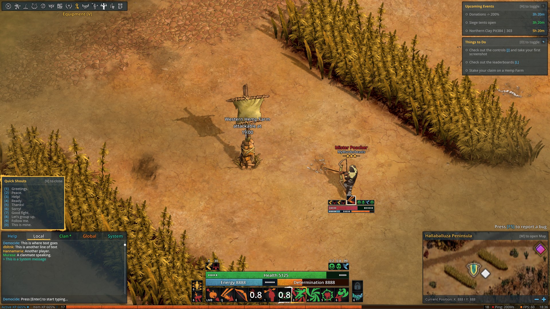
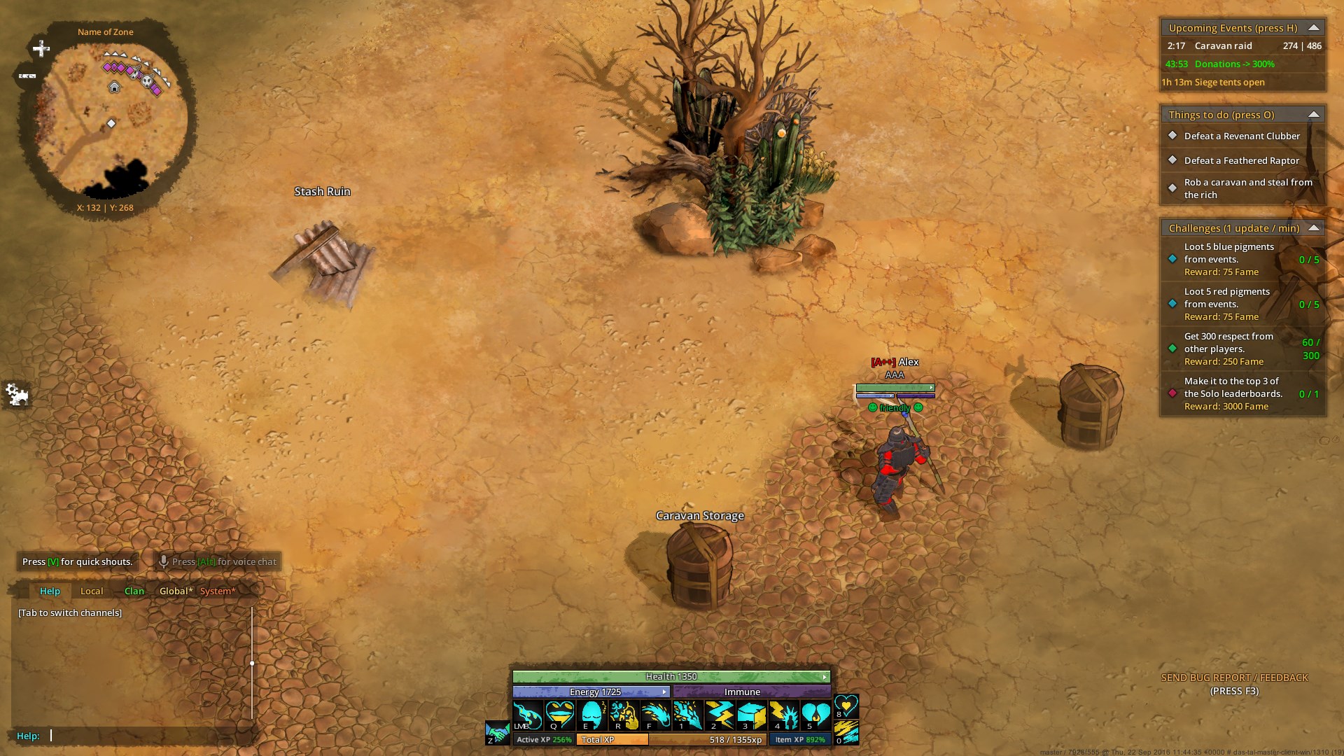
In the latest blog post from The Exiled we get a glimpse of the recently redesigned user interface: a far cleaner look. The team cites the following as being changed:
- The mini map moved to the bottom right and it got a lot more space. It also now mirrors the screen ratio which makes it easier to show your relevant surroundings.
- The menu bar finally has more room. When we put it on the left side of the screen years ago it only had a couple of buttons. Now that is has grown considerably it needed more space.
- The XP bar is finally decoupled from the skill bar. It closes the screen off very nicely and we even managed to fit in a clock, FPS and ping display that is always visible.
- There are a lot of small tweaks that make text and buttons more easily readable.
- And of course we have massively re-structured the on-player UI (name, health bars etc.). Those will not always be as massive as in the picture above. We are going to configure it in a way where it disables it’s child elements when not used. So no cast icon or debuffs when you are not in combat. No health or energy bars when you are full anyways.
The new UI should make its appearance in the next alpha test.
The Exiled team has also been hard at work improving player movements, updating in-game artwork, and adding new mobs to the game's world.
If you're interested in The Exiled you can sigh up for a shot at the next alpha by visiting the sign-up page. Or, head to the game's website to learn more.
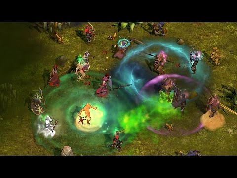
The Exiled - Official Reveal Trailer